You can customize charts and reports specific to your go-to-market strategy in the chart designer.
Chart types
Refer to the following table for a description of all the available chart and report types you can build:
Type | Description |
|---|---|
Build charts with the raw entities (Salesforce Data) and the GTM entity of that plan.
Example: In the territory designer, you can report on all entities related to the account object. In the teams designer, you can report on all entities related to the people object. | |
Build charts with the GTM entities and the CRM object that is relevant to that plan.
Create tables that summarize your go-to market hierarchy and the related assignments and targets.
Example: In a territory plan you can report on the account object and in a team plan, you can report on the people object. | |
Create reports summarizing the assignments and coverage plan for your company. This can be used to visualize assignments and roles for people by hierarchy,
Example: Table of AEs by Territory | |
Create a list of all accounts for each role or person to see for what they are responsible. Portfolio reports are useful when the same person is assigned to accounts at multiple nodes in the hierarchy.
Example: Table with Columns for Territory, AE Name, Account Name, Tier, Bookings Potential | |
Commissions Report | View and compare commissions earned across different territories, and track and analyze forecasted commissions against your revenue and quota targets. You can also monitor and assess pipeline sufficiency to ensure future commission goals are met, and generate detailed reports on individual deal performance and payout statements. Example: A table displaying individual deals closed, including the deal name/ID, with specific commissions rates applied to that deal and the commissions earned. |
View how proposed changes would impact key metrics. You can view the current state, the proposed changes, and the difference between the current and proposed. | |
Comparison Chart | Compare the same metric across select territories. Customize the chart to view numbers impacted by your proposed changes against that plan. Example: Number of tier A accounts in a given territory vs any other territory |
Attainment Chart | Build a chart displaying targets and how far people are from achieving them. Example: AE quota attainment by Quarter. |
Data Quality Chart | Build a chart that displays the state of your data at a glance. Example: Completeness of zip code data. |
Display fields, values, and metrics overlaid on a map. Example: Heatmap of Number of Tier A accounts across all the US sales territories | |
Scenario Basic Chart | Build a simple chart to view data related to the scenario planner or capacity planning. |
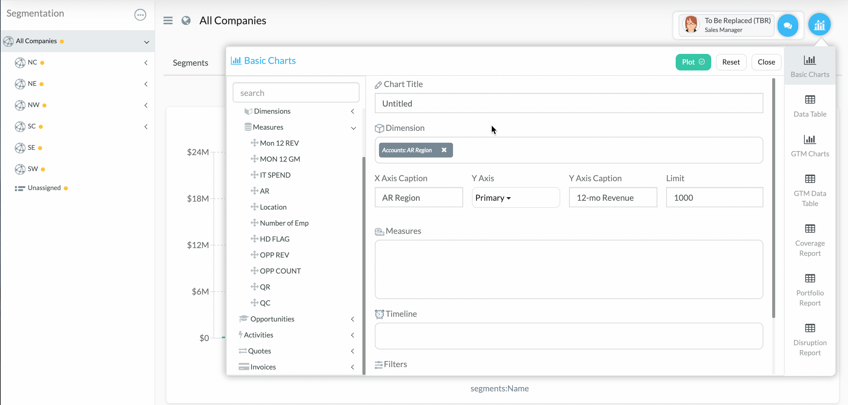
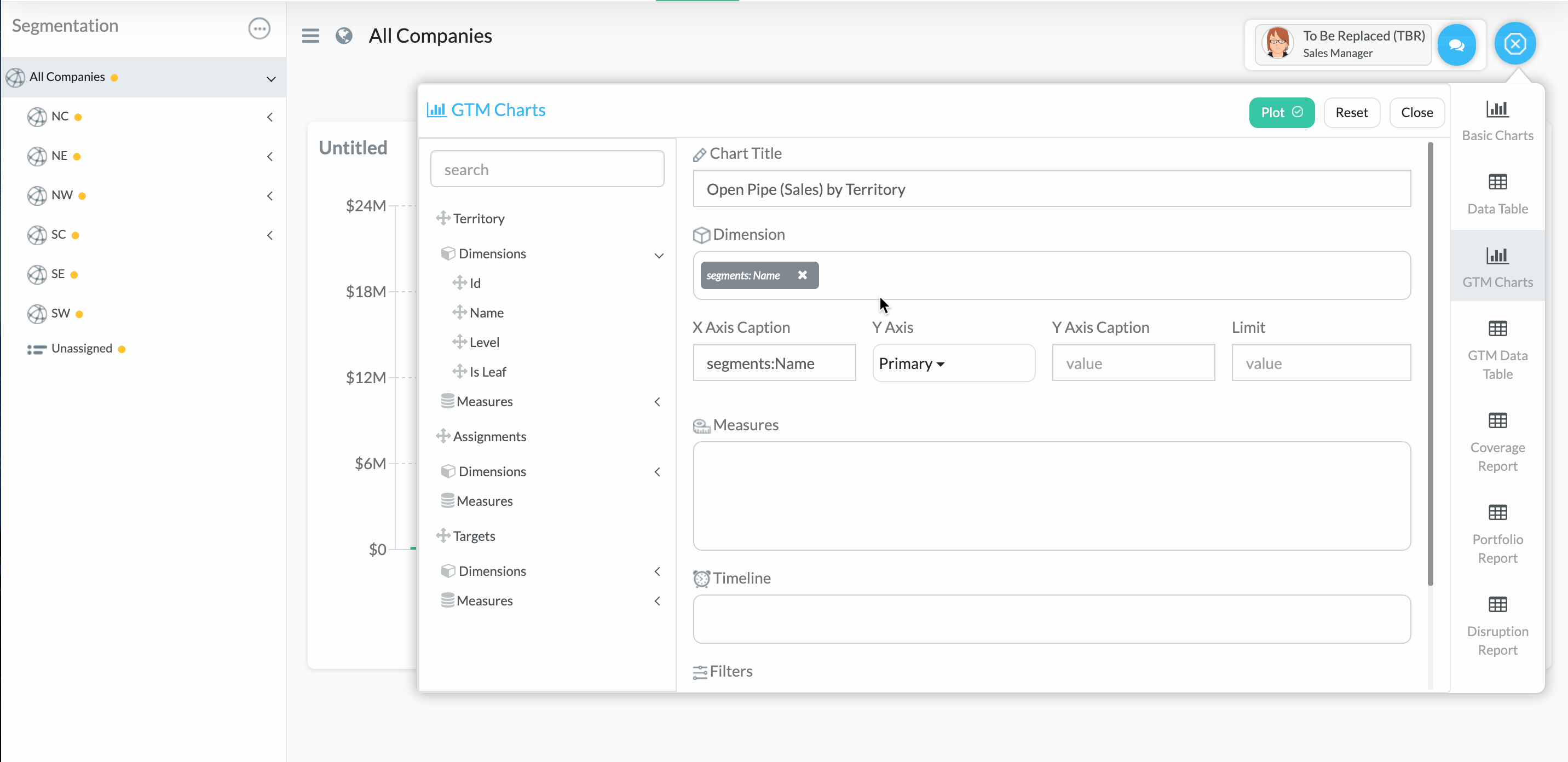
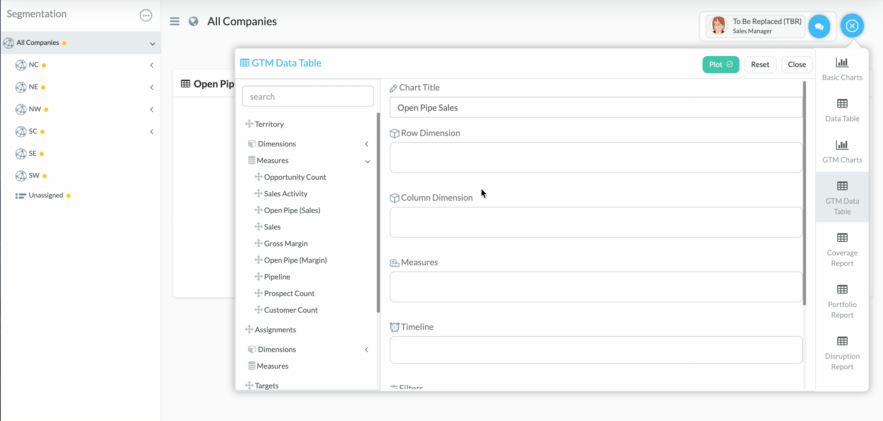
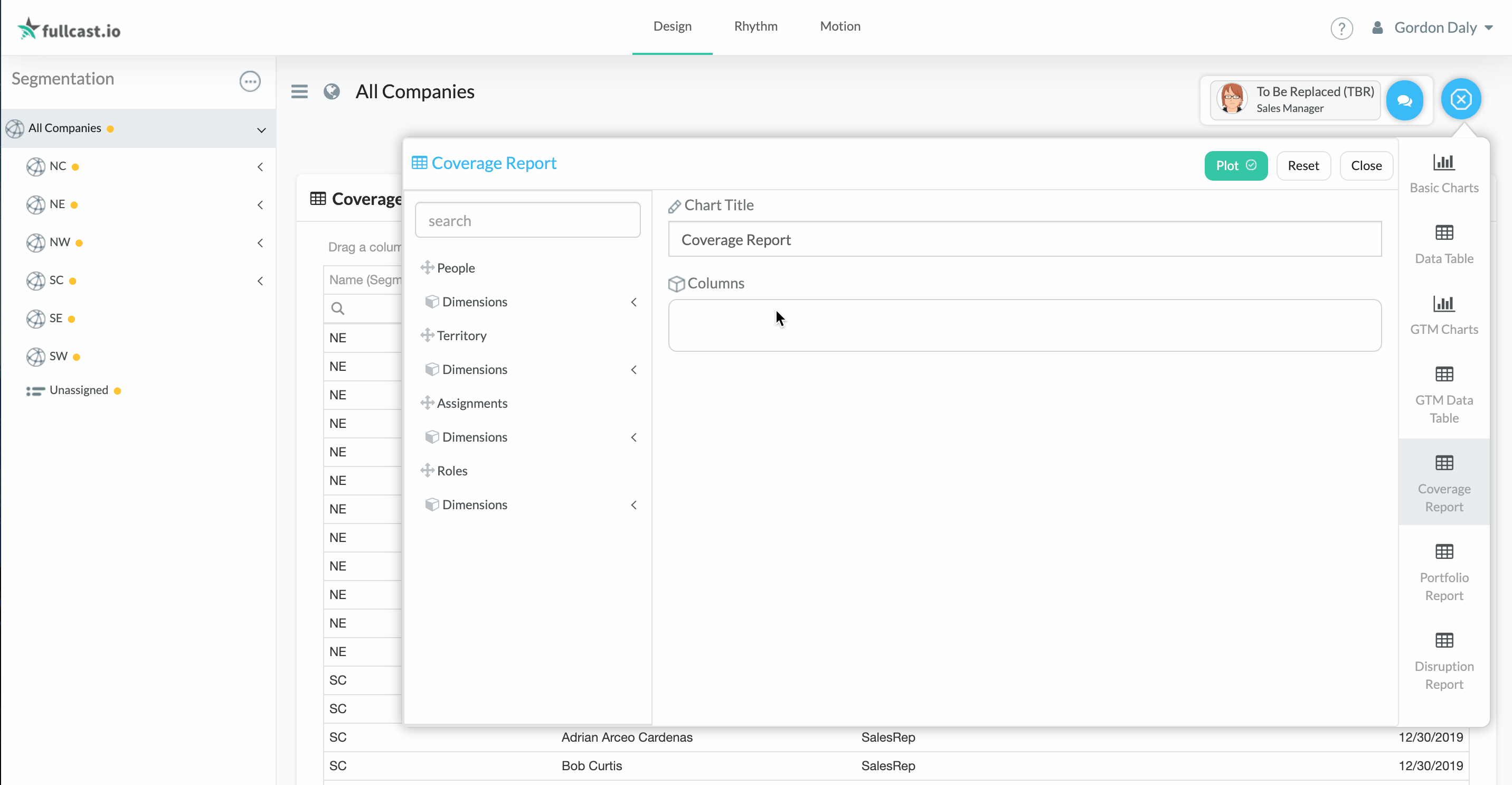
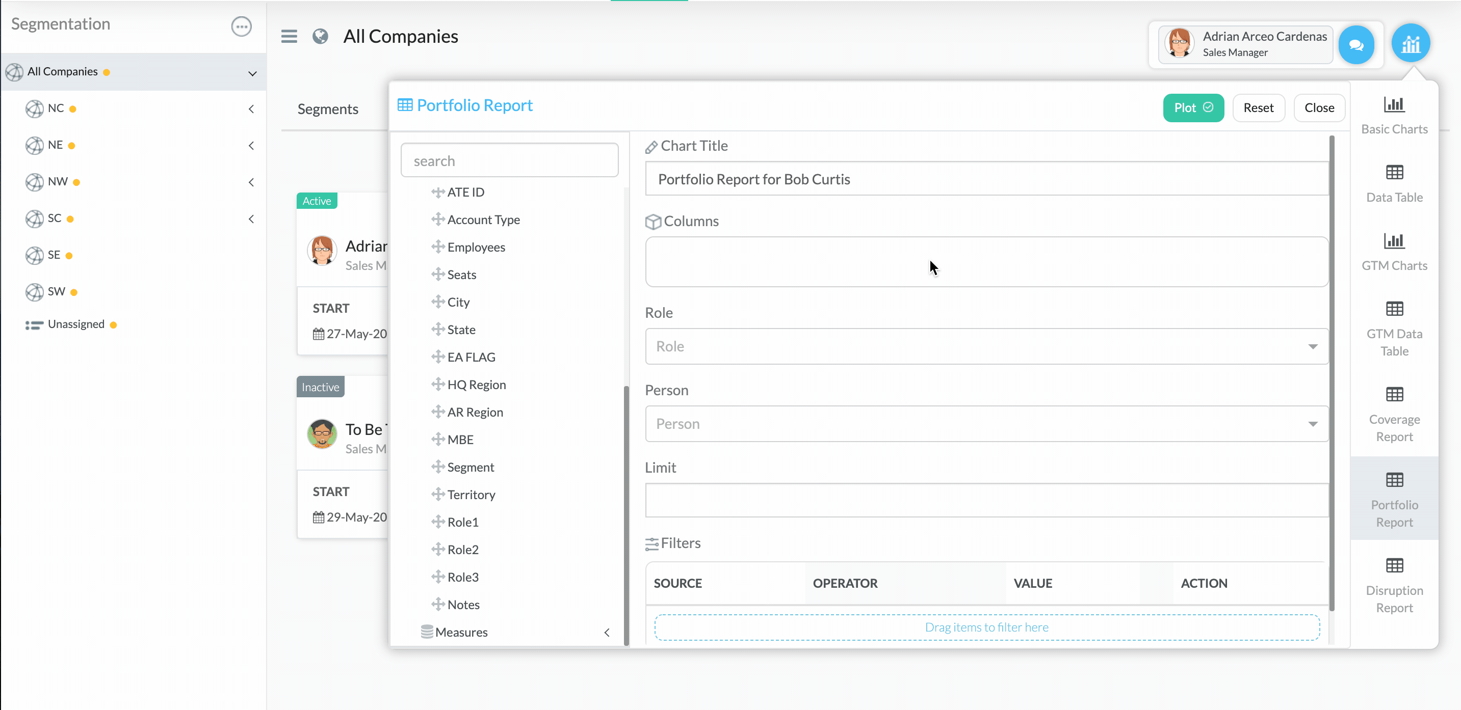
Use the chart designer
On the right side of the chart designer, select the chart type you want to create.
.png)
In the Chart Title field, type a appropriate title for the chart.
Add the necessary dimensions and measures to the chart by dragging and dropping from the available entities (use the search field to search for dimensions and measures).
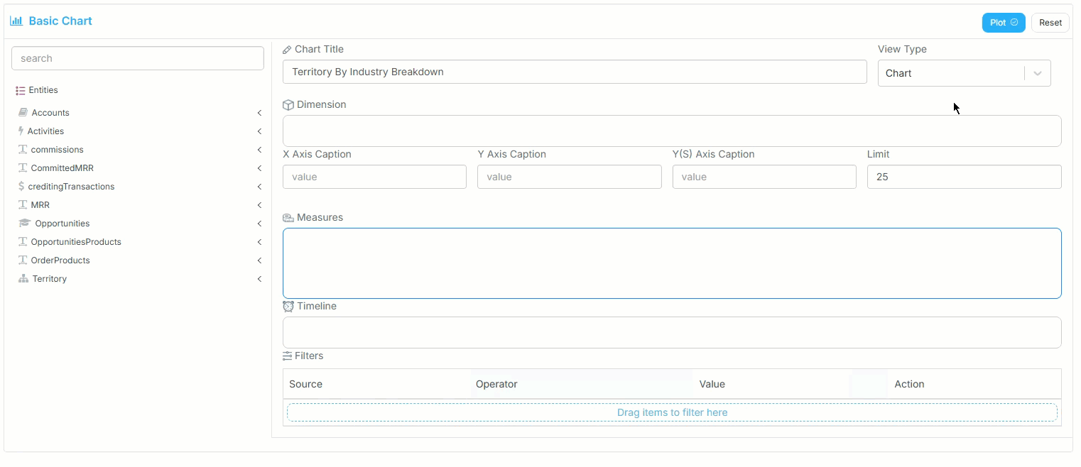
Add any timeline fields, filters, or limits, as needed.
Click Plot.